With the ever-increasing proliferation of smartphones and tablets in the consumer marketplace, it is more important than ever to tailor your web site design to reach as many mediums as possible. With the currently across-the-board supported CSS2 standard, designing a website to be visually appealing and user-friendly across multiple screen sizes was tedious at best...nightmarish at worst. Heap on top of that the fact that not only are users viewing websites on their desktops, laptops and smartphones; now developers also have to consider tablets, e-readers, game consoles and large screen televisions. Traditionally, a developer would have to use Javascript to detect the screen size and conditionally load additional CSS for each potential screen size or range or specific browser they were required to handle.
Now, with CSS3 supported across the full range of modern browsers, developers can leverage enhanced media queries that can target specific screen sizes or a range of screen sizes. Media queries are one of the inherent pieces of a technique called Responsive Design, the purpose of which is to re-align how web developers think about structuring their site markup and CSS. The term responsive design was first conceived by Ethan Marcotte, and is a sort-of natural evolution of previous techniques like Mobile First and Progressive Enhancement, which use the same basic foundation of design…but it was Responsive Design that brought the technique into the mainstream.
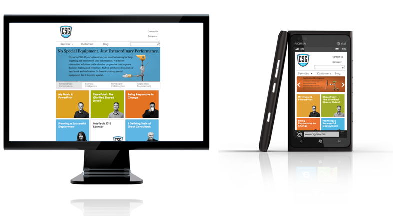
With our new website, it was important for us to reflect our commitment to giving our customers the best interface possible. So with the new design, responsiveness to as many mediums as possible with a single, flowing layout was the ultimate goal.
We started by choosing a responsive framework, of which there are many. For what we needed, the LESS framework was ideal. In using LESS for the basis of the site's CSS, and expanding upon it where needed, it made dealing with different layouts much simpler and decreased our development time significantly. Instead of having to deal with clunky and unreliable browser sniffing Javascript, we were able to keep all of our medium-specific layout logic isolated to only CSS, which increased maintainability and provided a much more reliable way of detecting screen sizes.
In summary, the increasing support of CSS3 specifications allows us to be more efficient when designing for multiple mediums. Pre-rolled responsive frameworks leverage this to give the developer an even better launching point to getting a new design up and running quickly, as well as allowing them an easy-to-maintain style system going forward. If you want to talk about how you can leverage Responsive Design on your next web project give us a call, we would be happy to help.