Formatting Data for Analysis
I frequently think of things I wish I could tell my younger self. I consistently recall a specific concept that took me a while to grasp when I began working with data. I never understood that it was necessary to “shape” or “rearrange” the data you are working with before making charts and graphs on it. I always just assumed that I didn’t know how use the visualization tools properly. As it turns out, making data visualizations is actually very easy once you format the data correctly. This post will walk through an example dataset that many of you have probably encountered. I am using Excel in this post, but the concepts apply with almost any software.
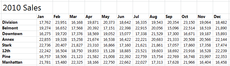
Let’s imagine we work for Stumptown coffee. We want to create some data visualizations to show our sales for each of our stores. This is the sample dataset we obtain:
It may seem like there is a lot going on there, so let’s break it down with colors!
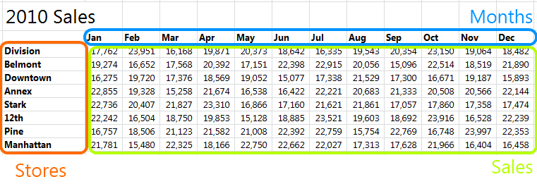
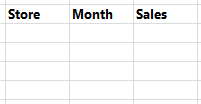
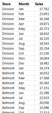
As humans looking at this data, we are able to glean a ton of knowledge from a small space. Strangely, computers don’t think like us, and they prefer to have their data differently. To begin reshaping this data, let’s make a new table with three columns that relate to the three colors in the above picture: store, month, and sales.
Now comes the tedious part. We will need to rotate out the data for each of the stores as illustrated here:
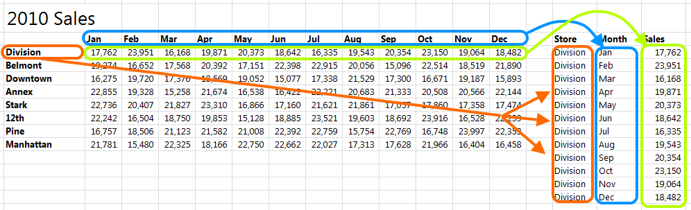
Do this same process for all the of the stores and you will end up with a pretty long table that’s much easier to analyze.
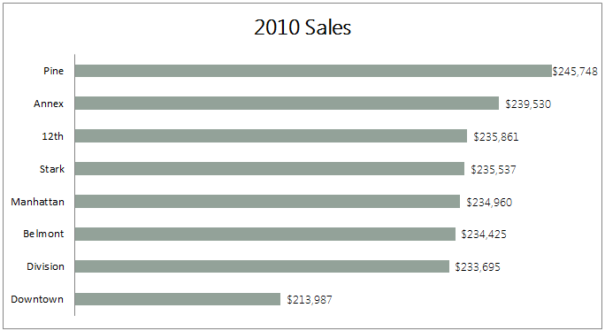
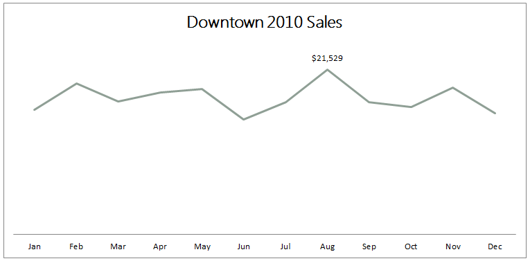
In Excel, I would make a pivot table off this table and throw together charts in a matter of seconds. In other software the process is likely just as easy now that your data is “computer friendly”! A word of advice, always try to store your data in the “computer friendly” method as it is way easier to convert it to the original form than it is to go the other way.
Posted on Thursday September 13, 2012